

Untitled by Ridi Winarno (the David Allen Collection)
BY KIMBERLY MAYER
This is one of those times when we live twice: in the real world and in the imagination. The task at hand was to design a condo by the sea in Solana Beach, California. My inspiration was “Malibu Style,” neutrals and naturals, light and white. Adhering to this with a cult-like devotion, I have to wonder, did I take it too far?
Our family gathered in the condo over the holidays. The NFL playoffs were underway on a flatscreen television playing soundlessly in the living room. I was holding our six month old grandson, trying to keep his eyes off the giant screen. Walking up and down the stone floored white hall, round and round the bleached dining table, his eyes searching–and before long I realized he’s looking everywhere for color. The baby was color starved. I am color starved. How did I not know this?
Everything I’d appointed was whites, naturals, some browns and black. I wanted to bring serenity, like a spa or sanctuary. Like a nest. But I caved when it came to the guest room, throwing in a stroke of light terracotta or clay because I thought I would crack without color.
It must have been at this time I started designing another condo in my head, taking the same footprint and color saturating it. And there it exists, mentally, alongside this condo. Come on in, if you will.
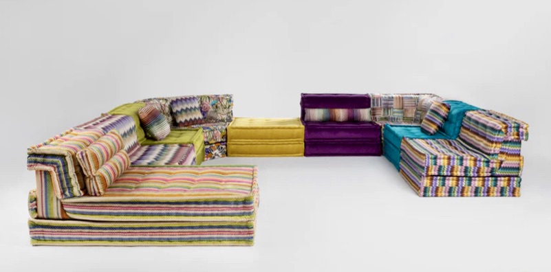
Man Jong by Roche Bobois
Deep green trees greet you on the patio, and because in my mind I live here year-round and can tend plants, they are carried through inside, blurring the distinction between interior and exterior. Each room steps outside. The living room is landscaped in Missoni fabrics on Mah Jong, the modular sofa by Roche Bobois. Sprawled, stacked, and juxtaposed to make any composition, it’s like a visual collage on the floor. Blues, saffron, rust, reds, pinks, and greens, you might think you stepped into a Moroccan riad. You will want to take off your shoes.
Baths are papered in large lush tropical prints, and everywhere there will be potted trees and plants. I’ll grow fruits of color: oranges, lemons, and lime. A wall of books arranged by color, and everywhere art. I’m presently looking at large, brilliantly colored canvases by Ridi Winardo, Indonesian Asian modern and contemporary painter (David Alan Collection, Solana Beach CA). I would love to live with his work.
Again and again from our condo of all-the-earthy-tones-I-could-get-my-hands-on, I frequently retreat into this color saturated condo in my mind. And then I slip back again, from the plethora of color to a monochromatic meditative state, and I am at rest. But that’s just me.


Kim, what a lovely piece. You have such a gift for aesthetics and you write about them with such grace and style. If only we could visit your second condo.
Love, Tug
Thank you. This is it and you are the first to be invited!
Your 3 year old grandson was a step a head of you. As I frequently saw in your photos and videos, he’s been supplying you and your condo with a vast range of crayon, chalk and paint colors in his many pieces of art. I suggest you display some of his colorful works of art. He, you and his baby brother can then feast on color.
Great idea. When my daughters were young I hung an enormous blackboard in a kitchen with a tray of colored chalk.
what a great piece can’t wait to see it when we visit San Diego in Mary
You’re going to be there? Let us know!
Kim, I think Beth has the right idea! Speaking as a constant color-craver.
I’m thinking I could be comfortable in white or neutral interiors with color in the art and accents, but we’ll never know unless I redo what I have done.
I love this piece Kim and it speaks to me not only with your words but especially with the visual images it paints in my mind.
Word wise, your use of alliteration or maybe consonance, (I think that’s what it is called), neutrals and naturals, white and light is most appealing. Your sentence structure as well as your paragraph structure appeals greatly to my tastes as a reader as well. You combine longer, compound/complex sentences and insert occasional, relatively short declaratives as if to keep me focused, effectively so.
Your story weaves its way around so many universal experiences we all encounter, at least here, out West, the tv, (which I abhor, or at least want to), sports and this preoccupation with blended colors particularly as we age. Lol. Then, using the child to point out your deficiencies we realize in the end, this perception is not about the child but about you and our need to see the accents color brings to our world, one which should never be painted in the more subtle shades of browns or beiges without the accent of pronounced color, the type a child craves.
Thank-you
As you know, what grandchildren give us is immeasurable!
Kim – I love how you describe the peaceful surroundings and yet the little thorn that can emerge when we suddenly feel color starved. You’ve created a sanctuary that eliminates noise and distractions. Something that is likely only appreciated after one has passed through the phase of being seduced by noise and distraction. Bravo!
That may be the appeal and the reason why so many Airbnb’s look like spas. They are short term resting spots. I think you are brilliant.
As always, I can relate to your thoughts, accept to the joy and wonder of seeing the world through the eyes of a three year old grandson. In all my homes, muted colors ruled in furniture. The pop came with vibrant colors in pillows, bedding, dinnerware, flowers, and art; most of which I altered in spring and winter. Hurry home, dear Kim. The island is missing your vibrant ‘color’!
I think your approach is right and I love changing with the seasons. Just need more shelves, drawers, and closets!